My book, Reflection: The Stranger in the Mirror, has been up on NetGalley for a couple of weeks now, and I’m already getting some really useful feedback. While most of the feedback has been positive, the opinions on my cover have been mixed. I would hate for anyone to be turned off about my story because they don’t like the cover. I’ve already got a new ebook cover lined up (which I’ll be posting about soon), but I’m undecided on the update for the paperback version.
So the question is, which of these do you prefer: the original, new version 1, new version 2, or new version 3?
|
|
|
|
|
|

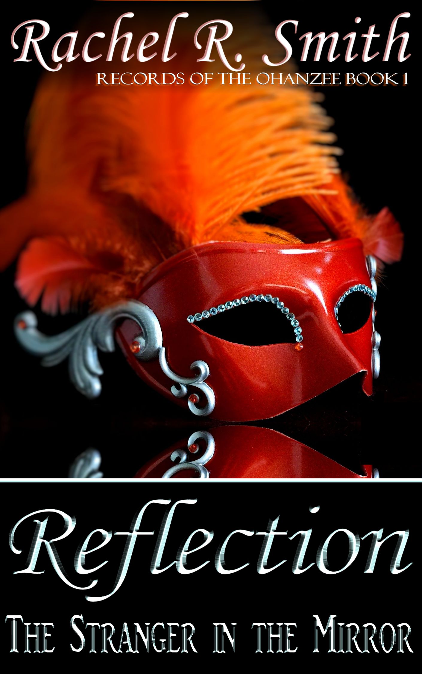


I actually enjoy the original. In my opinion, the first words on the cover should be the title, because that’s what sells books (unless you’re so famous that your name has become its own brand).
Just my two cents.
LikeLiked by 1 person
You have a really good point about placement–that was my exact thought when putting together the original design. I wanted to try switching things around on the revamp, but it would be easy to switch the positions. Then again, it seems like the original is pretty popular, so maybe I’ll just keep it for the paperback. 😉
LikeLike
Original 😉
LikeLiked by 1 person
Seems to be a popular opinion tonight! ^_^ Thank you!
LikeLike
I prefer the original. It has a better balance and a more readable typeface.
LikeLiked by 1 person
Thank you! It definitely seems to be the most popular here.
LikeLiked by 1 person
I like version 3 the best. I saw your book on netgalley, the blurb was tempting!!
LikeLiked by 1 person
Thanks! It will be up for a few more months if you’re interested in reading/reviewing. ^_^
LikeLiked by 1 person
original is so original and perfect, perhaps let the mask sit on a glass for the photo. The words however are perfectly in order.
LikeLiked by 1 person
Sorry about the delayed reply. For some reason your comments went to my spam folder (and they definitely aren’t!). Thanks for sharing your thoughts on the cover. I’m going to try a blend with the image from the new versions, but using the font and arrangement of the original. 🙂
LikeLiked by 1 person
It’s okay dear. That will be superb. Let’s see the finished work. Well done. And you most welcome.
LikeLiked by 1 person
New version 3 – the typeface fits with the look of the mask, plus I like the tie-in to the title with the mask’s reflection. Overall, I feel it has a more professional, polished look.
Perhaps the title should be at the top, rather than your name but then I think the title is still prominent enough to not be a problem.
LikeLiked by 1 person
Thank you so much for your input! Although I do like the original image (I put a lot of work into it!), my initial concept for the cover was to have just the mask with its reflection. I couldn’t get that to work with the tools I had available to me at the time (an iPhone camera and Microsoft Paint haha). So, I’m partial to this new version of the image, but I’m not loving the font. Can I ask what it is about the typeface that you like? Is it the font itself, or the metallic look? I’m thinking that I may try a blend of the new and original image.
LikeLike
Right now I like the original version because it is clean and balanced as leggypeggy said. I also agree with Jonathan that the title should be prominent which it is in the original. My eyes can easily see and process the whole front cover in one glance.
That said, I actually prefer the image of the other versions with version 3 being my favorite. Version 1 feels chopped off and version 2 doesn’t have the same amount of mask reflection as version 3.
In my opinion (take it as that) version 3 best compliments the title. We see the reflection of the mask and a mask implies a “stranger.” Who is this stranger? The title and image draws me in!
My problem is with the font. The font is trying to compete with the image and is distracting. A different font and Title/Author switch might just make version 3 the winning ticket.
Good luck with the cover! I hope my suggestions were helpful!
LikeLiked by 1 person
Thank you! I’m actually working on a blended concept like you’ve described–with the new image but original font/layout. I’ll make a new post with the revision later today.
LikeLike
Did the people who didn’t like the original give any constructive feedback? I like the original the best.
LikeLiked by 1 person
Unfortunately, the survey in NetGalley is just a yes/no type of input, so I don’t have a feel for *what* wasn’t working. But all the feedback I’ve been getting from comments and emails on this post has been really insightful!
LikeLike
Original, definitely.
LikeLiked by 1 person
I’m coming to this so late I won’t vote, but I’d be interested to know if you found the survey useful.
LikeLiked by 1 person
I would definitely say that the survey has been useful. Since I cross-post on multiple media platforms, I got responses back on each one and by email. Getting multiple perspectives, from people with varying backgrounds and skill sets (and who aren’t already personally invested in the work) helped me to rapidly come to a decision that probably would have taken me months to reach otherwise!
LikeLiked by 1 person